InterfaceUI · 10
Confirmshaming: the "No thanks, I like paying more" button
A pop-up offers a discount. The button to accept says "Yes, save me money". The button to decline says "No thanks, I enjoy paying full price". That second button has a name: confirmshaming. Here is how it works, why it is used and how to recognize it.
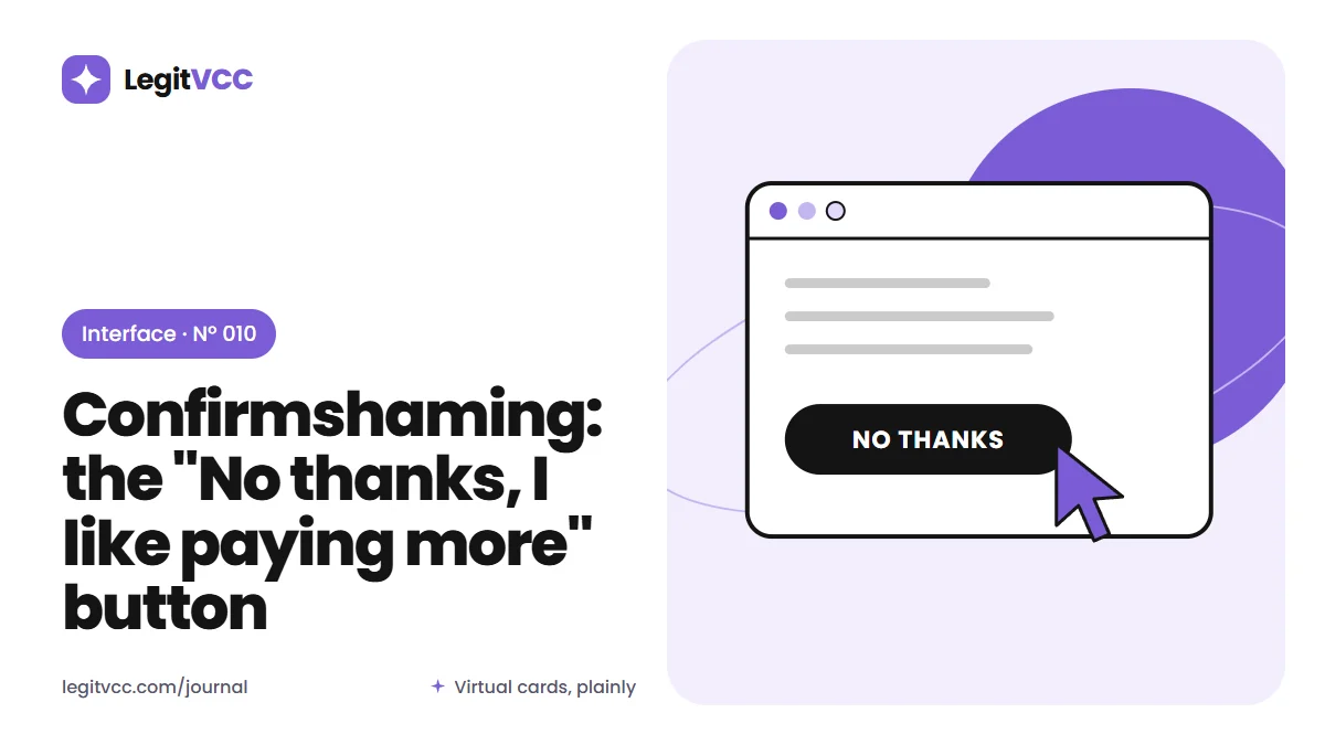
A box slides over the page: "Get 10% off your first order!" Below it, a large, bright button says "Yes, I want to save". Underneath, in small gray text, a link says "No thanks, I'd rather pay full price."
Nobody would say that sentence out loud. It exists only to make declining feel slightly embarrassing. When the button for saying no is written to make you feel foolish, the design is arguing with you instead of asking. This trick has a name, confirmshaming, and once you notice it, you see it everywhere.
Where the name comes from
The term was popularized in the 2010s by people cataloging "dark patterns": interface designs that steer users toward choices that benefit the business at the user's expense. Confirmshaming is one of the most recognizable, because it is written in plain language right on the button.
How it works
Confirmshaming relies on a simple asymmetry:
- the option the business wants is phrased positively, often in the first person: "Yes, I want the deal";
- the option it does not want is phrased as a confession of something undesirable: "No, I don't care about my security".
Even if you see through it, clicking the second button feels like agreeing with an insult. Some people click the first one to avoid that feeling, which is the point.
Common places to find it
- Newsletter pop-ups: "No thanks, I hate discounts."
- Cancellation flows: "No, I want to lose my benefits."
- Upsells at checkout: "No, I'll risk my parcel arriving damaged."
- Notifications: "No, I don't want to stay informed."
- Security prompts: "Skip, I don't mind being hacked."
The last one is particularly troubling, because it mixes manipulation with a real safety message and makes both harder to take seriously.
Why businesses use it
It works, at least in the short term. A few more sign-ups, a few more upsells, a few fewer cancellations. The cost is harder to measure: a little less trust, a slightly worse impression, the sense of being handled rather than served. Customers who notice the trick may wonder what other choices have been nudged.
A relative of drip pricing
Confirmshaming belongs to the same family as other checkout tricks. Like the hidden fees we described in drip pricing, it works by shaping the moment of decision rather than improving the offer. A good offer does not need its alternative to be insulting.
Regulators are paying attention
Consumer authorities in several places have begun to name manipulative interface design in their guidance, and some laws now address dark patterns on certain platforms. The rules differ, and confirmshaming alone is rarely the subject of enforcement. But the general direction is toward requiring choices to be presented fairly.
How to answer it
You do not have to argue with a button. A few habits help:
- Read the decline link for what it does, not for what it says about you.
- Close the pop-up with the X or the Escape key, if one is offered.
- Notice the pattern as information about the business.
- Check the actual offer: a discount that requires a subscription may not be worth it.
Fair alternatives
There is nothing wrong with offering a discount or an add-on. The fair version simply words both choices neutrally: "Get 10% off" and "No thanks". Or "Add protection" and "Continue without". Both buttons should be equally easy to find and press.
We compared honest and hiding fee pages in what an honest fee page looks like; the same test applies to buttons. Would the choice still look reasonable if both options were written by someone who did not care which one you picked?
Why it matters more for money
On a recipe site, confirmshaming is an irritation. On a payment page, it can push people into insurance they do not need, subscriptions they forget, or sharing data they would rather keep. The more money and data involved, the more the wording of a decline button matters. We wrote about reading the rules behind those choices in reading a refund policy like a skeptic.
How we word choices
We try to keep choices on our site neutral and rare. There are no pop-up offers, no upsells in the order wizard and no newsletter prompts. Where we do ask something optional, such as whether to remember a device, the box sits unticked with a plain label. The fees page shows the full price as a rule, so there is nothing to nudge you toward.
Confirmshaming in your inbox
The pattern does not stay on websites. Unsubscribe pages are a favorite home for it: "We're sad to see you go", "Are you sure you want to miss out on exclusive deals?", a cartoon of a crying mascot, and a button that says "Yes, I don't want savings". Sometimes the real unsubscribe option is a small link under a large button that only changes how often you receive email.
Read unsubscribe pages slowly. Look for the option that stops all messages, and check that you receive a confirmation. Many email apps also offer their own unsubscribe button at the top of marketing messages, which avoids the sender's page entirely.
Why it often backfires
Confirmshaming can win a click and lose a customer. People remember being talked down to, and screenshots of particularly smug decline buttons circulate widely, usually with the brand's name attached. A business that relies on guilt at the moment of choice is also telling you how it expects to treat you later, when you want a refund or a cancellation. That is worth more attention than the discount on offer.
Questions people ask
Is confirmshaming illegal?
Usually not on its own. Some laws address manipulative design more broadly, and the rules vary by place.
Does it really change what people choose?
Businesses use it because it tends to work on some people some of the time. Knowing the trick reduces its effect.
What should I do if a cancellation flow uses it?
Read each screen for the button that actually cancels, whatever it says, and keep a record of the cancellation confirmation.
- interface
- dark patterns
- checkout design
- manipulation